It's been almost 20 years since we started our translation company and for a while already, we have felt the rebranding itch. Our clients, the market and the whole world is changing and evolving constantly. So are we. And it is about time we start showing it.
Changing company logo and the visual identity is a major step and it takes up a lot of resources, but we are always trying to do the right thing at the right time.
In our case it means all digital platforms and materials, as 99% of our clients work with us exclusively digitally.
To bring this idea to fruition, a team of talented specialists are working on a brand-new website, client portal and all other documents you receive from us and visual materials you will see on our social media.
It is created from the soundtrack when our name “LMI” is being spoken.
The new logo is simple and black, because we see ourselves as the mortar to the brick for our clients and their businesses and want to make THEM shine and stand out.
The curved letter M in our name represents many things – the answer is always in the eye of the beholder - but we like to see it as a mountain pass that helps make the impossible possible. It is never easy, but always worth the trip.
We are so excited about this new change and upgrade on all levels!
Can’t wait to work with you on your next multilingual projects to convert your content into value.
From language to business.

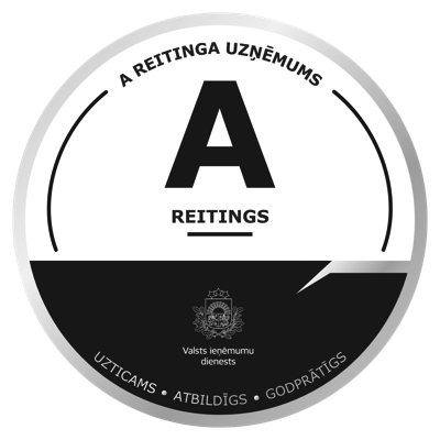
LMI Translations has been included in the highest “A” rating group by Latvia’s State Revenue Service for 2025, confirming trustworthy, responsible business.

Ensure full compliance before 2026. Audit your multilingual documents to prevent compliance gaps, avoid fines, and start the year strong.